- mexico

- Jun 4, 2018
- 0 min read
top of page
Search


- mexico
- May 7, 2018
- 1 min read
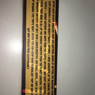
American designer David Carson says, “Don’t confuse legibility with communication.” What does he mean? What’s the difference between them?
Since David Carson was the outlier in the Helvetica movie - his fonts/prints were more experimental and artistic than other font artists - with his focus on the artistic look rather than the actual legibility - I believe he wants to put more emphasis on the emotion the reader receives from looking at his fonts rather than actually being able to read the font itself, which I'm quite fond of. David Carson is pretty cool in my opinion.

- mexico
- May 7, 2018
- 1 min read
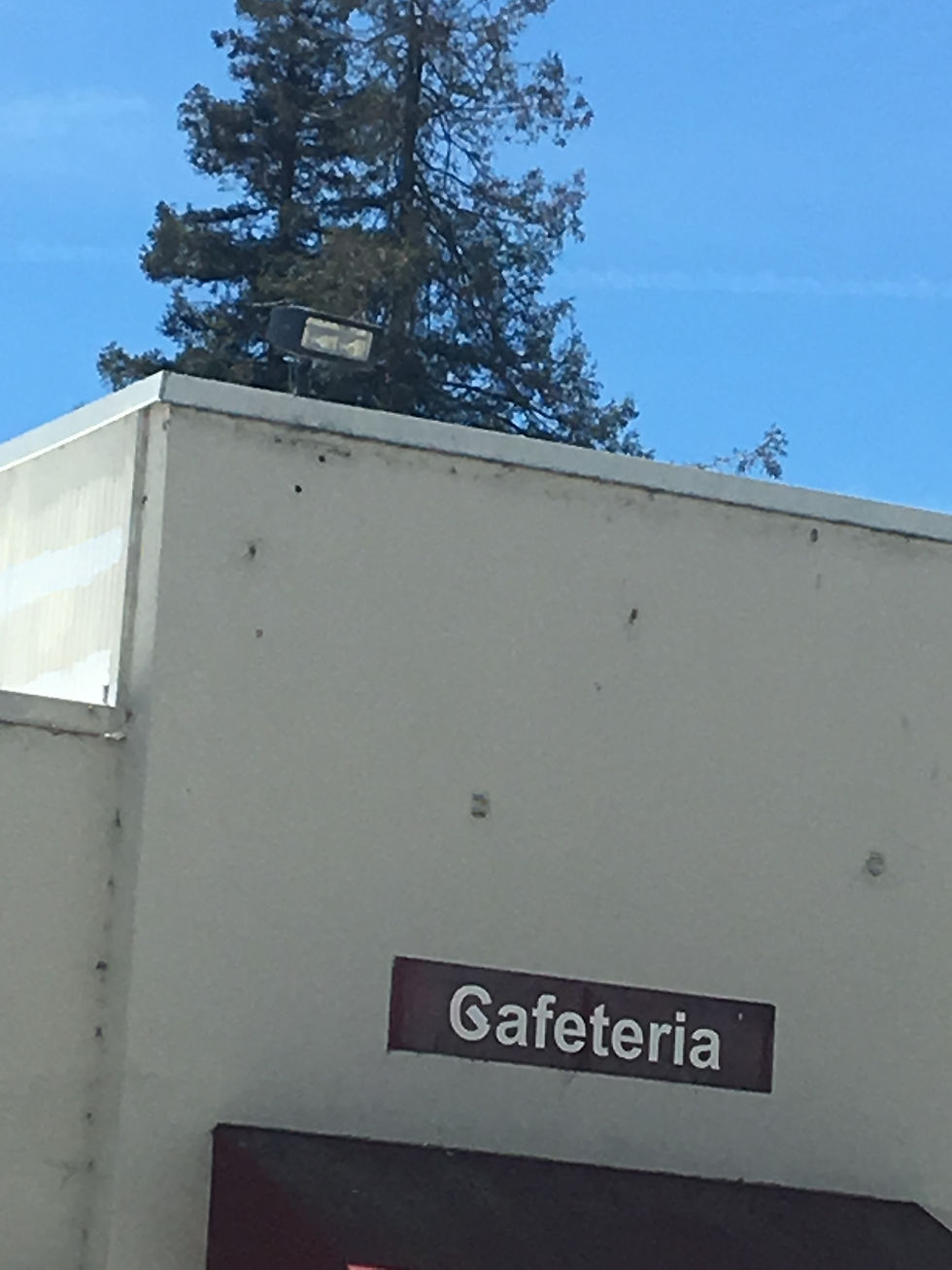
Where can examples of Helvetica be seen? Can you spot some examples on our own campus? Use your camera and take a picture of a few examples and include in your blog post.


bottom of page